Printable Poster Trends in 2025: Colors, Fonts, and Layouts That Work
Design trends move fast, but 2025 is shaping up to be a year where balance rules: designers are mixing warmth with boldness, nostalgia with modern systems, and handcrafted texture with AI-powered polish. Whether you’re designing posters for a brand campaign, an event, or wall art, understanding the visual language that resonates this year will save time and make your work feel current — without chasing every fad.
Below you’ll find the clear, actionable trends in colors, typography, and layouts that are proving effective in 2025, plus practical tips for applying them (and what to avoid).
Table of Contents
Why 2025 Feels Different: Context for the trends
Two forces are driving the aesthetics this year:
- A cultural appetite for comfort and authenticity after years of intense digital overload. Designers are leaning into warm, natural tones and tactile textures. Pantone’s 2025 Color of the Year, Mocha Mousse, reflects this move toward comforting, earthy hues.
- The opposite impulse: the need to cut through noise. Bold contrast, striking type, and mixed-media visuals help posters and campaigns stand out in feeds and physical spaces. Adobe’s 2025 trend roundup highlights “Bold Minimalism,” mixed media, and metallic treatments as big forces designers are using to create impact.
Design in 2025 is therefore less about one single direction and more about smartly pairing warmth with visual punch.
Color Trends: What’s working and how to use it
Warm earth tones + modern accents
Expect palettes rooted in warm, comforting tones — think cocoa, clay, and rich browns — paired with bright accents (neon orange, teal, or electric pink) to create contrast. These pairings give you emotional warmth and visual urgency at once. Pantone’s 2025 palette guidance centers a warm brown as an anchor, which designers use as a neutral base that still feels modern.
Retro pastels with saturated pops
Nostalgia continues in the form of soft pastels (muted lavender, washed peach) that are punctuated by saturated secondary hues for attention. This mix works well for lifestyle and consumer-facing campaigns because it reads both familiar and exciting. Trend reports show designers favoring retro-inspired palettes refreshed for modern contexts.
Metallics and texture for premium feel
Metallic touches and textured finishes (grain, paper fibers, or subtle embossing) are back in demand for physical prints and upscale digital mockups. When used sparingly, these elements add perceived value to posters and promotional materials. Adobe’s trend list specifically mentions metallics and textured grains as notable for 2025.
Font Trends: Readability meets character
Variable fonts and expressive families
Variable fonts are mainstream now. They let you fine-tune weight, width, and slant from a single file, enabling responsive typography that adapts across sizes and mediums. This capability is becoming standard in brand systems and poster design because it preserves visual identity while offering flexibility.
Bold serifs and neo-retro revivals
Serifs are returning with attitude — chunky, contemporary serifs and retro-inspired display faces help headlines feel authoritative and memorable. At the same time, designers are blending vintage letterforms with modern spacing and contrast to avoid looking dated. CreativeBoom and other typographic forecasts highlight this serif comeback alongside neo-retro choices. Creative Boom
Handwritten & humanist touches
Hand-lettered scripts and humanist sans-serifs remain popular for adding warmth and approachability. These pair well with more rigid headline fonts, creating a layered typographic hierarchy that feels crafted rather than templated.
Layouts & Composition: Rules to break — and rules to keep
Bold minimalism: fewer elements, stronger message
“Less but bolder” is a reliable strategy. Large-scale type, strong negative space, and a single bold visual element can be more effective than intricate compositions, especially when attention spans are short. Adobe lists “Bold Minimalism” as a major theme for 2025 — think big headlines, tight messaging, and decisive imagery.
Mixed media and collage for tactile richness
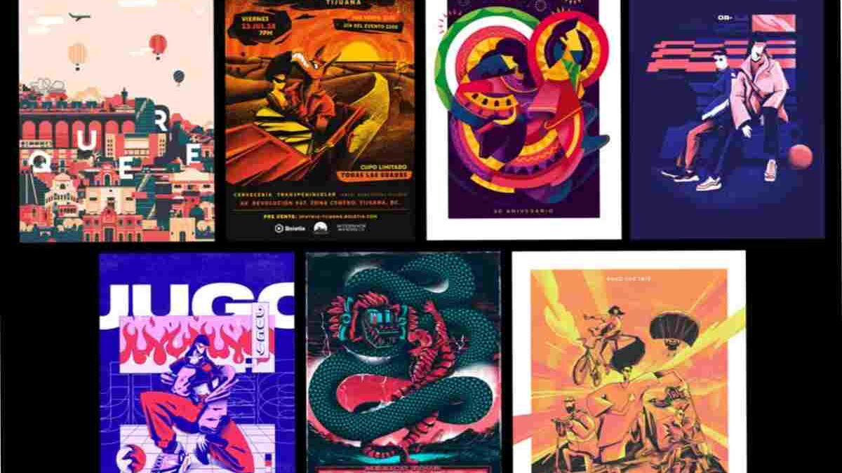
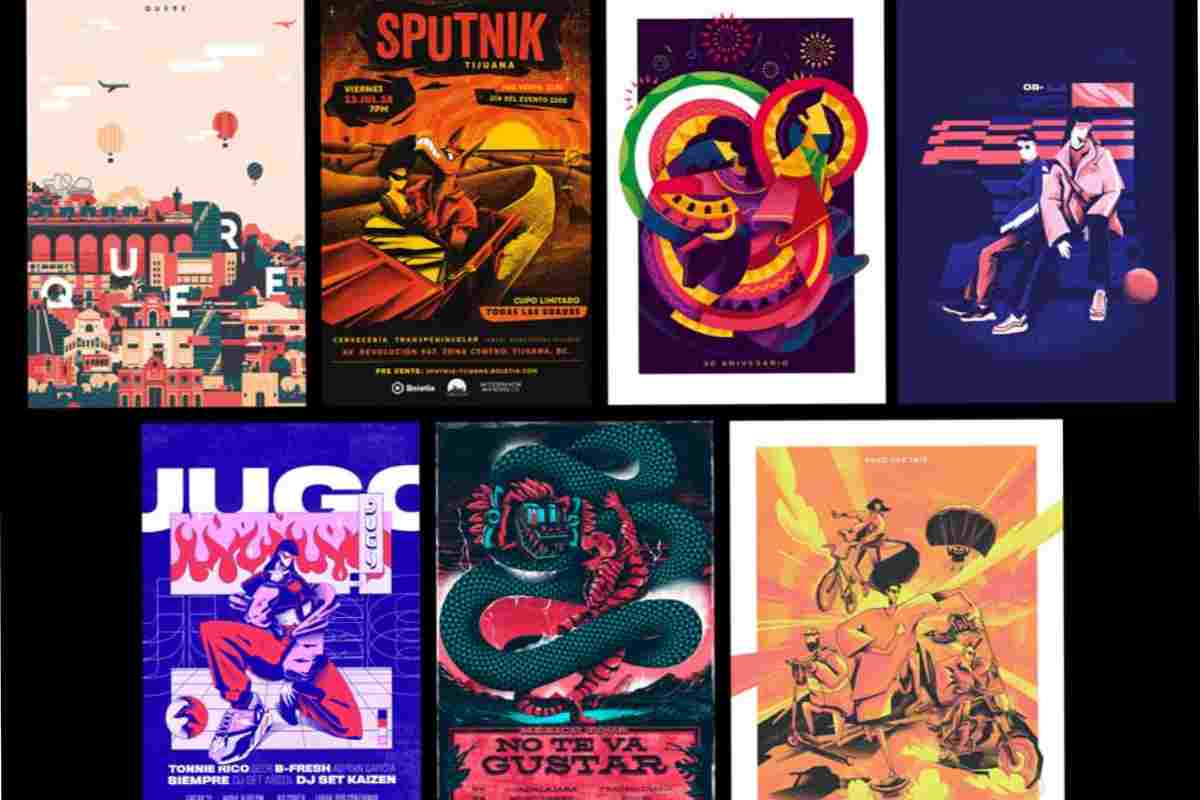
Layering photography, drawn elements, textures, and geometric shapes creates a tactile, editorial feel that performs well in both print and social. Designers use overlays, grain, and collage to add authenticity and visual depth — a clear counterpoint to flat UI-inspired aesthetics. Behance trend pieces and poster showcases have shown a rising interest in this mixed-media approach.
Asymmetry and kinetic layouts
Asymmetric grids, broken baselines, and layouts that imply motion are trending, especially for event posters and promotional pieces. These layouts capture attention and suggest energy, but they require careful hierarchy so the message remains readable.
Where to place the single phrase (practical use case)
If you’re producing an event poster, a quick, high-impact way to include a call-to-action is to pair a bold headline with a short subhead and a scannable QR code. For example, a bright accent color on a neutral brown field draws the eye to essentials — date, place, and a small note where users can printable poster versions are available for attendees to download and share. (Place this line near the QR code or small-print instructions to keep the main visual uncluttered.)
Actionable design checklist for 2025 posters
- Pick an anchor color: Start with a warm earth tone (Mocha Mousse or similar) and add 1–2 accent colors for contrast. pantone.com
- Choose a headline font family: Use a bold variable font or modern serif for main headlines; reserve a humanist sans or script for supportive copy. fontspring.com+1
- Decide on texture: Add a subtle grain or paper texture to print jobs; consider metallic foils for premium pieces. Adobe
- Prioritize hierarchy: Large headline, concise subhead, clear CTA. Use negative space aggressively.
- Test at scale: Print a small proof (or export at the pixel size you expect) — bold type that reads on-screen can misbehave in print.
- Make it flexible: Use variable fonts and modular layouts so the design adapts to social tiles, email headers, and large-format prints.
Pitfalls to avoid
- Over-trending: Don’t force a trend that clashes with your brand voice. Trends should enhance, not hijack, your message.
- Legibility sacrifices: High-contrast color combos and aggressive type treatments can look cool but hurt readability if not tested.
- Ignoring production: Metallics and heavy textures look great in mockups but add cost and complexity in print runs — always check budgets and lead times.
Final thoughts: Blend comfort with punch
Design in 2025 rewards thoughtful balance: anchor visuals in comforting, tactile tones while using typography and layout to demand attention. Whether you’re crafting posters for walls or feeds, mixing warm palettes with bold type, textured finishes, and flexible systems will keep your work contemporary and effective.
Also Read: https://www.worldwidewebblog.com