Pie Chart Maker for Effective Data Visualization – A pie chart maker is a practical tool that turns raw numbers into clear visual stories, making it easier to understand proportions and relationships at a glance. In 2025, with data playing a central role in decision-making across industries, a pie chart maker helps students, business owners, marketers, and personal users present information in a way that is both simple and impactful. Whether you are showing budget breakdowns, survey results, or market share distribution, this tool allows quick creation of clean, professional charts without needing advanced software. This guide explains how to use a pie chart maker effectively for different purposes, from business reports and educational presentations to personal finance tracking and marketing insights, with step-by-step instructions, design tips, and practical examples to help you communicate data more clearly.
From quarterly sales reviews to classroom lessons or household expense summaries, a pie chart maker in 2025 makes complex data accessible and visually engaging for any audience.
Table of Contents
The Value of Pie Charts Across Different Fields
Pie charts excel at showing how parts make up a whole, making them ideal for situations where proportions matter most. In business, they help illustrate revenue sources, expense categories, or customer demographics, allowing managers to spot trends quickly during meetings. For education, teachers use them to explain concepts like population distribution or resource allocation in a way that students can grasp immediately.
In personal finance, a pie chart maker turns monthly spending into an easy-to-read visual, highlighting areas like rent, food, and savings to support better budgeting decisions. Marketers rely on them to display campaign performance, such as traffic sources or conversion rates, helping teams adjust strategies on the spot. Health professionals use them to show nutrient breakdowns or patient statistics, making reports more approachable for non-experts.
The strength of a pie chart maker lies in its simplicity: one quick chart can replace pages of numbers, improving understanding and retention by up to 40% compared to text alone. In 2025, with data literacy becoming a core skill, these tools help users across fields turn numbers into narratives that inform and persuade.
When to Choose a Pie Chart Maker Over Other Chart Types
A pie chart maker is best when your data adds up to 100% and you want to emphasize relative sizes rather than exact values or trends over time. For example, it works well for market share among competitors, budget allocation, or survey response distributions. However, it is less effective when you have many categories (more than 6-7 slices become hard to read) or when showing changes over time, where line or bar charts perform better.
In business reports, a pie chart maker shines for high-level summaries like “Revenue by Product Line,” while detailed comparisons might need bar charts. For educational content, it helps visualize “Time Spent on Subjects” but should be paired with numbers for accuracy. In personal use, it clarifies “Monthly Expense Breakdown” so users can see at a glance where adjustments are needed.
Choosing the right moment to use a pie chart maker ensures your visuals support rather than confuse the message, keeping presentations clear and professional.
Step-by-Step Guide to Using a Pie Chart Maker
Adobe Express offers a straightforward pie chart maker that works directly in the browser. Here is how to create one.
Step 1: Prepare Your Data
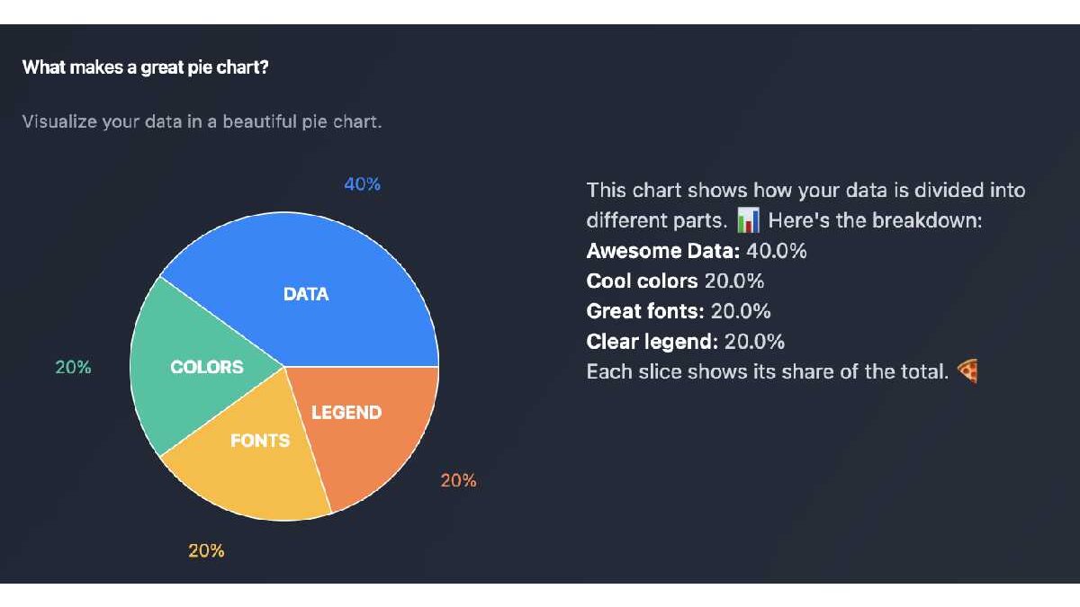
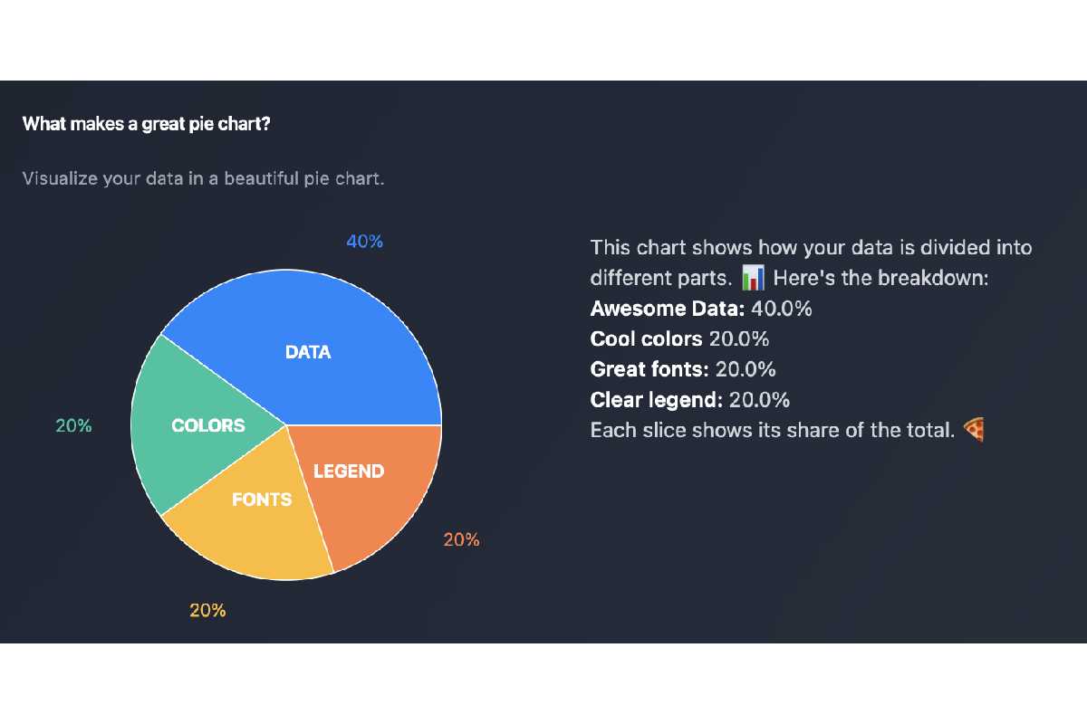
Gather the numbers that add up to 100% or a whole. For example, list categories and percentages: Rent 35%, Food 25%, Transport 15%, Savings 25%. Decide on labels and colors that make sense for your audience.
Step 2: Open the Tool
Go to the Adobe Express pie chart maker. Select the pie chart template or start with a blank chart. The interface is simple and guided.
Step 3: Input Data and Customize
Enter your categories and values in the data table. The chart updates live. Adjust colors for clarity, add labels with percentages, and choose a style (3D for visual interest or 2D for clean readability). Add a title and legend if needed.
Step 4: Export and Use
Preview the chart on different backgrounds to check contrast. Download as PNG for web use or PDF for reports. Embed in presentations, websites, or documents. A small business owner created a budget chart this way and used it in monthly reviews, making discussions much clearer.
Tips for Clear and Effective Pie Charts
- Limit slices to 5-7 for readability
- Use contrasting colors that work in both light and dark modes
- Always include percentages or values for accuracy
- Sort slices from largest to smallest unless showing a specific order
- Add a clear title that explains what the chart shows
- Test on mobile devices since many viewers use phones
Avoid using pie charts for precise comparisons or time-based data, where other chart types perform better.
Frequently Asked Questions
Q: When is a pie chart the best choice?
A: When showing how parts contribute to a whole, and the number of categories is small.
Q: Can I add my own images or logos?
A: Yes, most tools allow overlaying logos or custom icons on the chart.
Q: Best file format for reports?
A: PDF for print, PNG for web and presentations.
Q: How accurate should the percentages be?
A: Round to whole numbers for clarity, but show exact values in a table if needed.
Q: Is it free to use?
A: Basic features are free; premium unlocks advanced customization and higher resolution.
Conclusion
A pie chart maker like the one in Adobe Express is a simple yet powerful way to turn data into clear visual stories. By preparing your numbers, inputting them thoughtfully, customizing for clarity, and exporting appropriately, you can create charts that communicate effectively.